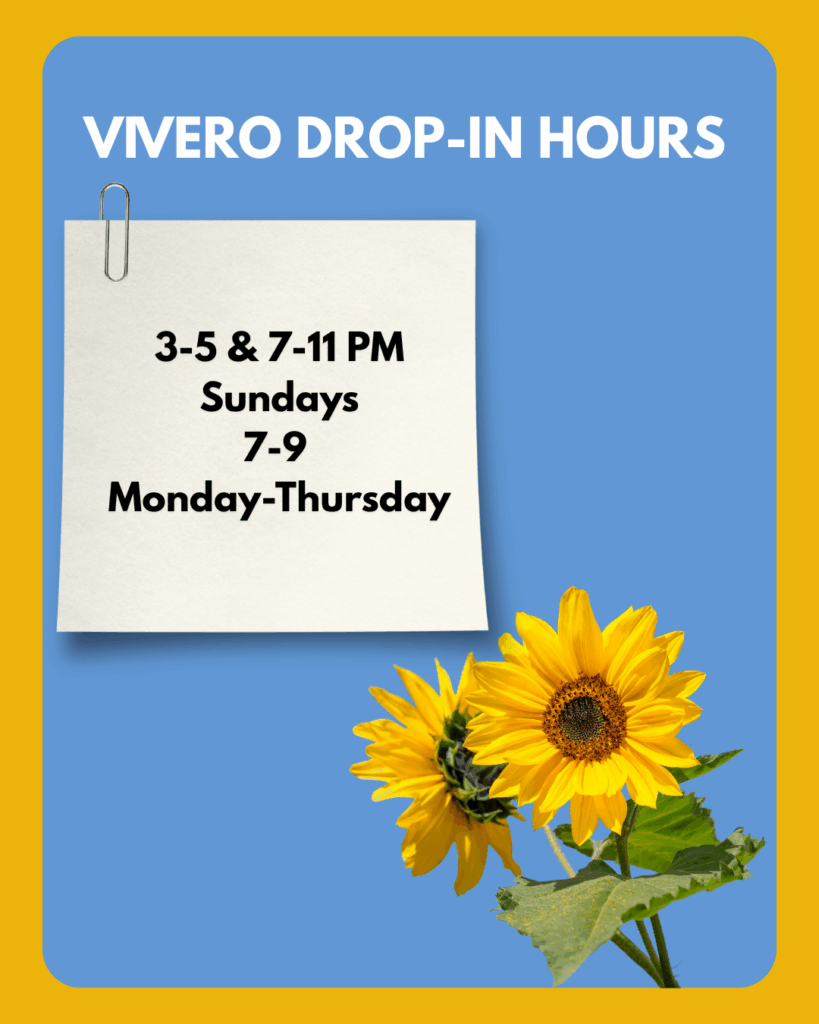
My October training was focused on level-up training, and I decided to work on creating visually compelling graphic designs for the advertisement of Vivero and, possibly (and hopefully) the use of these graphic design posters for social media advertisement.
I decided to focus on graphic design for my training for these two weeks due to my interest in creating graphic design posters for events and my interest in a career in Marketing and social media management.
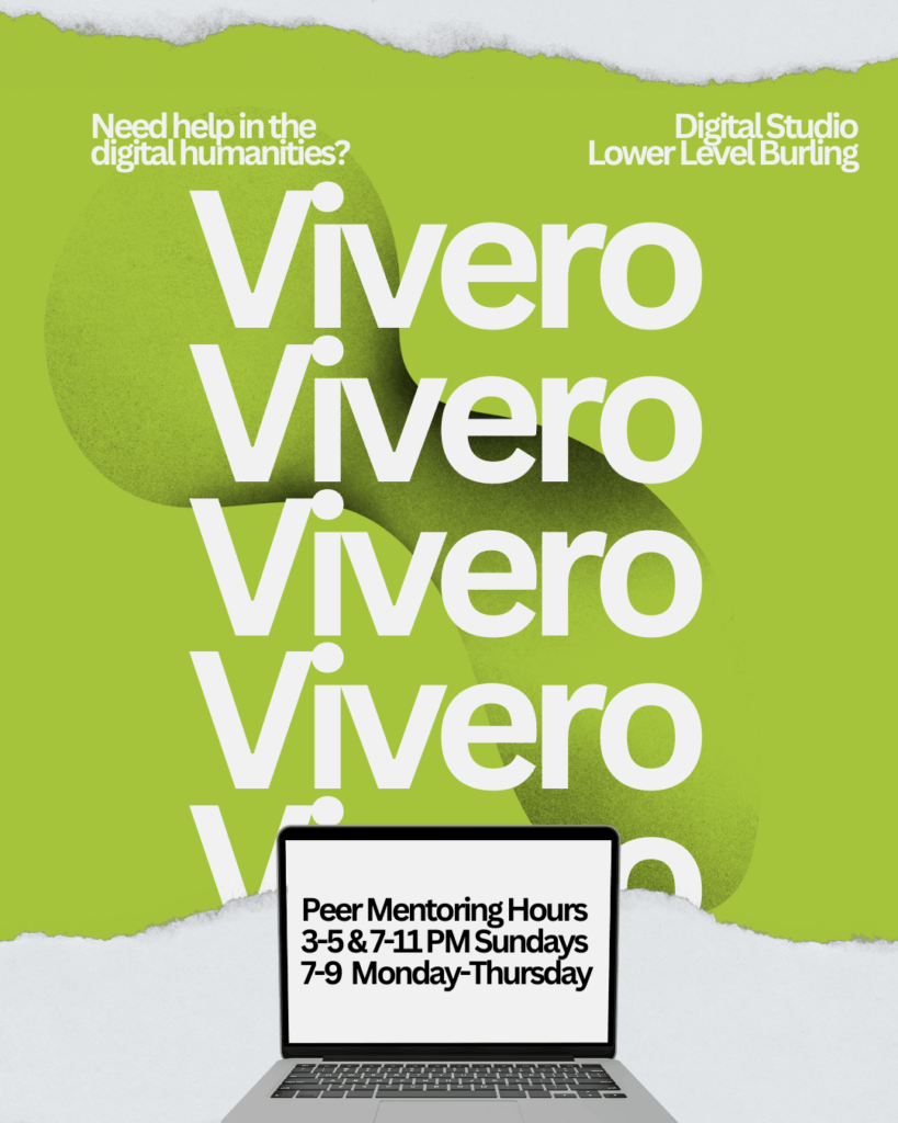
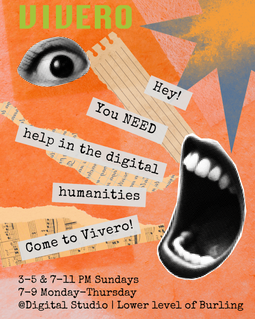
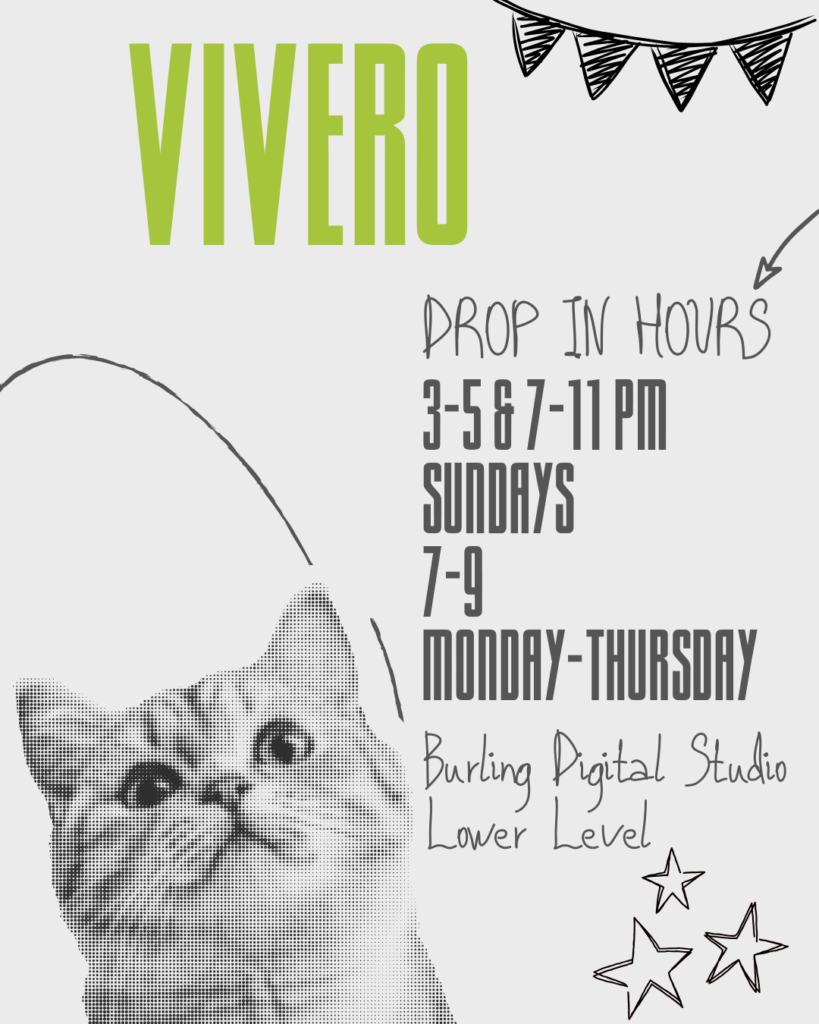
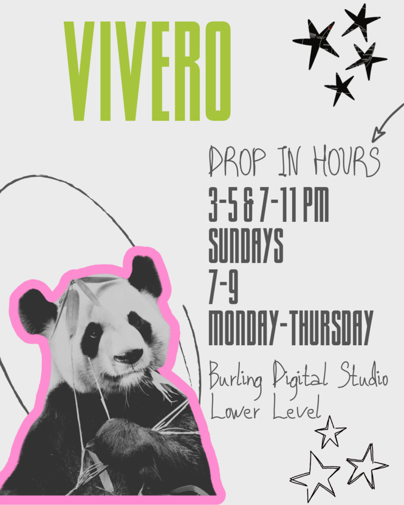
I began my journey for this training by observing the colors Vivero uses on their website, as well as the aesthetics of the website. I also looked around the HSSC for posters to evaluate the information provided to make the best out of the posters I would be creating. Then, I started brainstorming “what is it that draws my attention to a poster when I’m so consumed with my own life?”. And then I listed a few options. “Colors, a creative design, texture, animals, human parts of the body, nature, bright colors”, where the elements that catch my attention, and it is exactly what I wanted to encapsulate in my posters.
After that, I started creating the posters, looking at different elements and thinking about which animals could possibly catch people’s attention. Then I added all those elements (animals, colorful text, textures) into my Canva page and started tweaking them around to see where I could go with my designs.
I ended up with five social media / graphic design posts. Overall, I thought this was an illuminating experience where I was able to explore creatively my digital advertising abilities using an online graphic design tool. I look forward to hearing feedback and how these designs could be improved!